The Art of Data Visualization: From Static Figures to Animations
A practical guide to designing clear, compelling figures and animations — lessons from years of communicating complex data.
A figure that looks good but confuses the reader has failed. A figure that's ugly but clear has succeeded. After years of doing science and building data products, I've learned that good visualization is mostly about ruthless clarity — and knowing when to animate.
The One-Sentence Test
Every figure you make should pass a simple test: can you describe its main message in one sentence? If you can't, neither can your reader. This isn't about oversimplifying — it's about knowing what you're actually trying to say before you try to say it visually.
A good figure does two things at once: it delivers a takeaway and provides the evidence behind it. The takeaway is your interpretation. The evidence is the data. Both need to be present, and neither should drown out the other.
Know Your Audience
The single biggest mistake I see in scientific figures is calibrating them for the wrong reader. A figure for a specialist journal can assume domain knowledge, use field-specific terminology, and pack in dense evidence. A figure for a general audience needs to do the opposite.
Ask yourself: who is reading this, and what do they already know? Then adjust your labels, your color choices, your level of detail accordingly. A figure optimized for a Nature paper will bomb on a slide deck, and vice versa.
Choosing the Right Figure Type
Not all data belongs in a chart. The question is: what format best reveals your message?
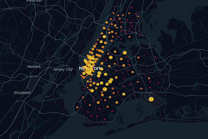
- Photos & maps — concrete, literal, high credibility. Use when spatial or visual accuracy matters.
- Illustrations & diagrams — flexible emphasis. Great for explaining mechanisms or processes.
- Graphs — comparisons, trends, distributions. The workhorse of scientific communication.
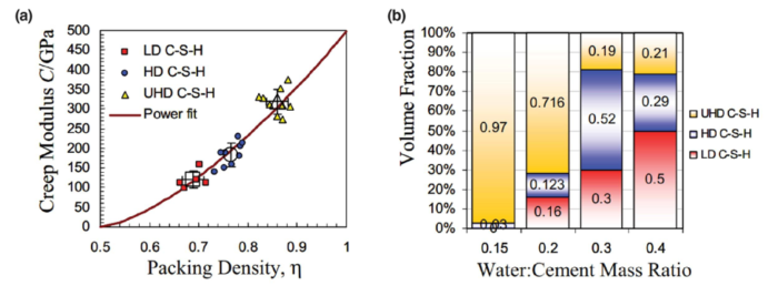
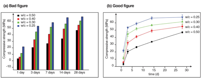
For graphs specifically, the chart type matters enormously. A bar chart and a line graph can show the same data and tell completely different stories:
Signal vs. Noise
Most figures have too much in them. Every element that doesn't support your main message is noise — and noise makes your signal harder to find.
Concrete things to cut:
- Data series that aren't relevant to the point you're making
- Legends that could be direct labels instead
- 3D effects on 2D data (they add visual complexity with zero information gain)
- Background images behind charts
- Excessive gridlines, tick marks, and borders
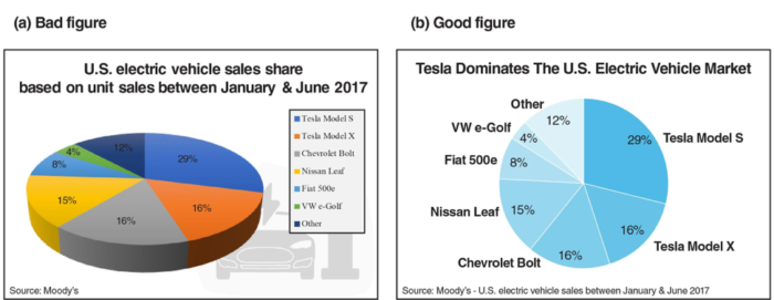
Simplify your color palette. Use colorblind-friendly schemes by default — tools like ColorBrewer make this easy. If you're using more than 4–5 colors, ask whether they're all earning their place.
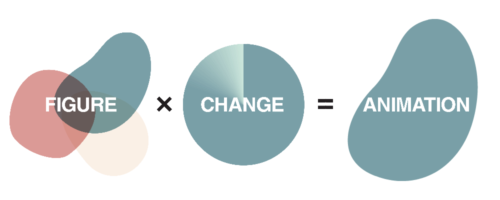
When to Animate
Static figures are the default. Animation should be a deliberate upgrade, not decoration.
Animation earns its place when:
- Your data has a time or spatial dimension that changes meaningfully
- You're working with high-dimensional data that's hard to collapse into 2D
- The transition between states is itself informative — not just the start and end
- Your audience is on a digital platform where they can pause, replay, and explore
If none of those apply, a static figure is almost always better. Unnecessary animation is distracting and can undermine your credibility.
Animating High-Dimensional Data
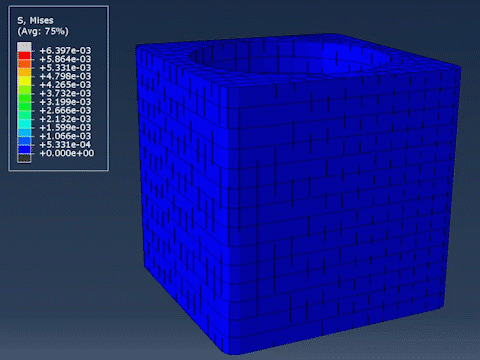
One of the most powerful uses of animation is in high-dimensional datasets. Consider a compression test simulation with X, Y, Z coordinates, elapsed time, and stress values — that's 5 dimensions. You can't show all of that at once in 2D. Animation lets you use time as a real axis, revealing dynamics that a static snapshot would miss entirely.
The key discipline is narrowing down. Which variables are central to your message? Animate those. Deprioritize the rest. Trying to show everything in one animation usually means showing nothing clearly.
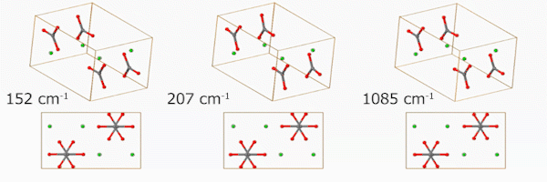
Molecular Visualization — Animation's Natural Home
Some data is nearly impossible to communicate statically. Molecular vibration modes are a perfect example — you can label a diagram with arrows, but motion is the message. Animation removes any ambiguity.
Platform Matters
Where your figure will live changes how you should design it:
- Papers — figures must stand alone. The caption should state the message outright, because readers often scan figures before reading the text.
- Slides — minimize text. Use animation to pace the delivery of complex ideas rather than front-loading everything at once.
- Posters — large labels, direct annotation, no legends if possible. You may not be there to explain it.
- Online / interactive — the reader controls the experience. Make sure your figure works without a voiceover. Captions need to carry the full explanatory load.
Tools Worth Knowing
Static figures: Python (matplotlib, seaborn, plotly), R (ggplot2), Tableau, D3.js for the web.
Animations: Python (matplotlib.animation, plotly), MATLAB, DaVinci Resolve or Premiere Pro for assembling frames. EZGIF is surprisingly useful for quick GIF assembly online.
Design polish: Illustrator or Inkscape to clean up exported SVGs. The difference between a figure exported directly from code and one that's had 10 minutes of layout attention in Illustrator is dramatic.
The Takeaway
Good data visualization is a discipline, not a talent. It's mostly about asking the right questions before you start: What's my message? Who's my audience? What format serves the data? What can I remove?
And if you're publishing digitally — take full advantage of it. Animate where it helps. Make it interactive where it adds value. Static figures made sense when print was the only medium. It isn't anymore.