✈️ Introduction
Finding the right flight can be surprisingly complicated. Is this fare reasonable? Should I try another airline? Is a layover worth the savings? Travel metasearch engines like Google Flights, Kayak, and Expedia help narrow the options — but the final call still comes down to judgment.
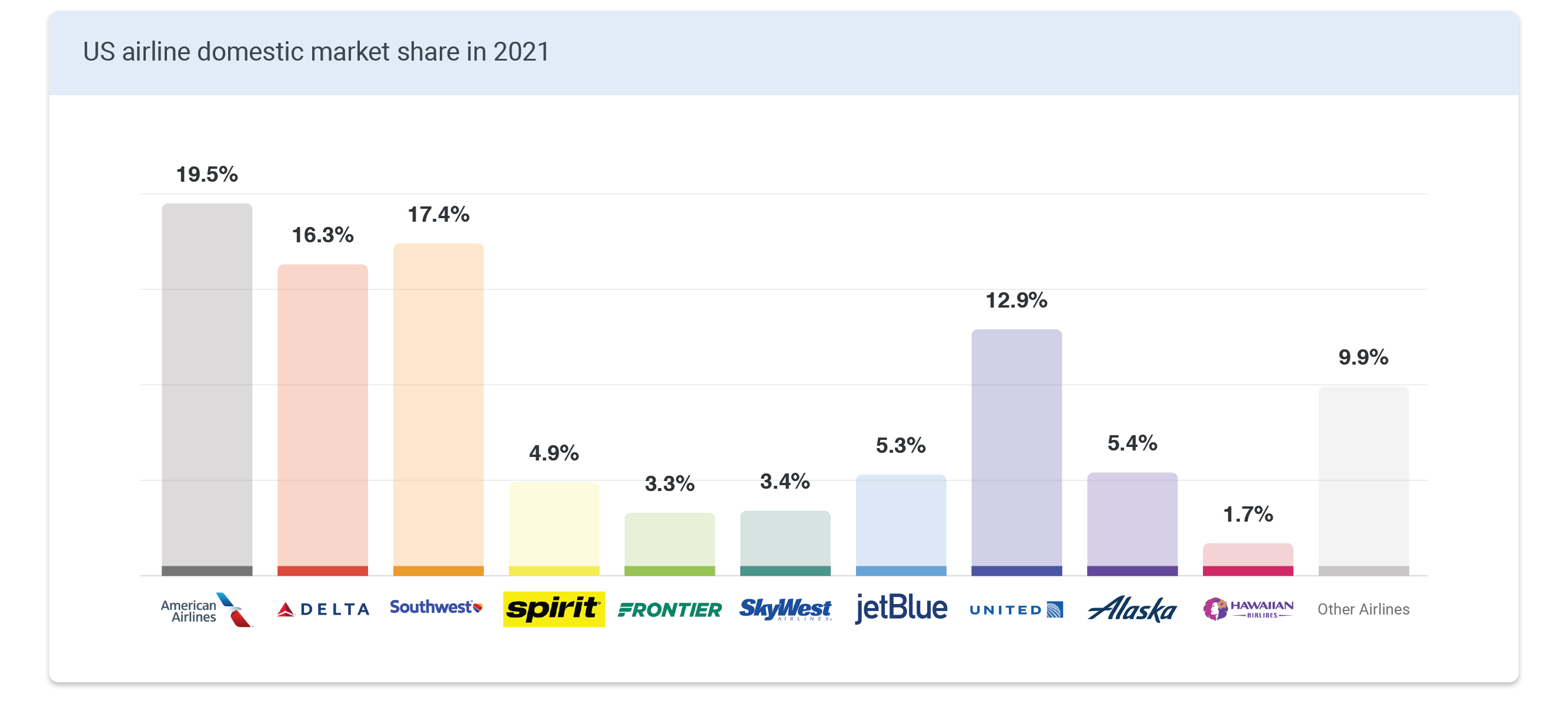
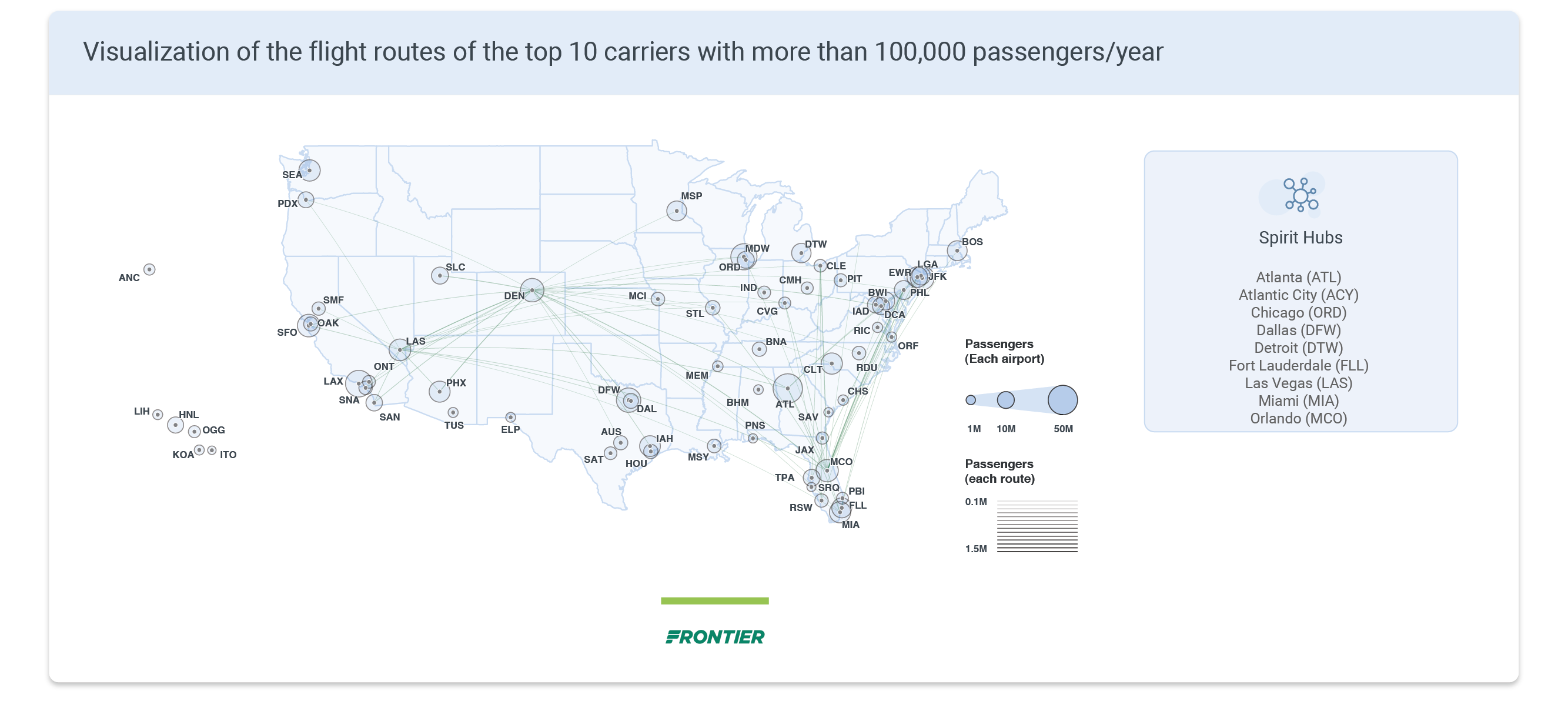
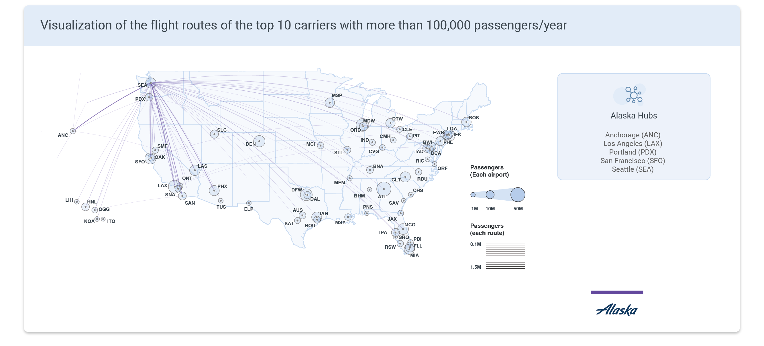
There are currently more than 60 US airlines connecting the 50 states, with the top 10 controlling roughly 90% of the market. In this competitive landscape, airlines face a constant challenge: how to price and route flights as efficiently and profitably as possible. The decision is far from simple — it depends not just on demand between two cities, but on every other route in the network, including competitors' routes. The map below visualizes the current state of US air travel. Circle size represents passenger volume per airport in 2021; line thickness represents traffic on each route; colors differentiate airlines.


🎯 Research Questions
This project examines the US airline industry and quantifies the effects of competition and monopoly on airfare. The questions worth asking differ depending on whose side you're on.
From the customer's perspective
- What does the US air travel network actually look like?
- Is my ticket cheaper or more expensive than average?
- Which airline offers the best value?
- What factors drive airfare?
From the airline's perspective
- How does competition affect ticket pricing?
- How should we price a new route?
- Which routes are worth targeting next?
🎫 Airfare Breakdown
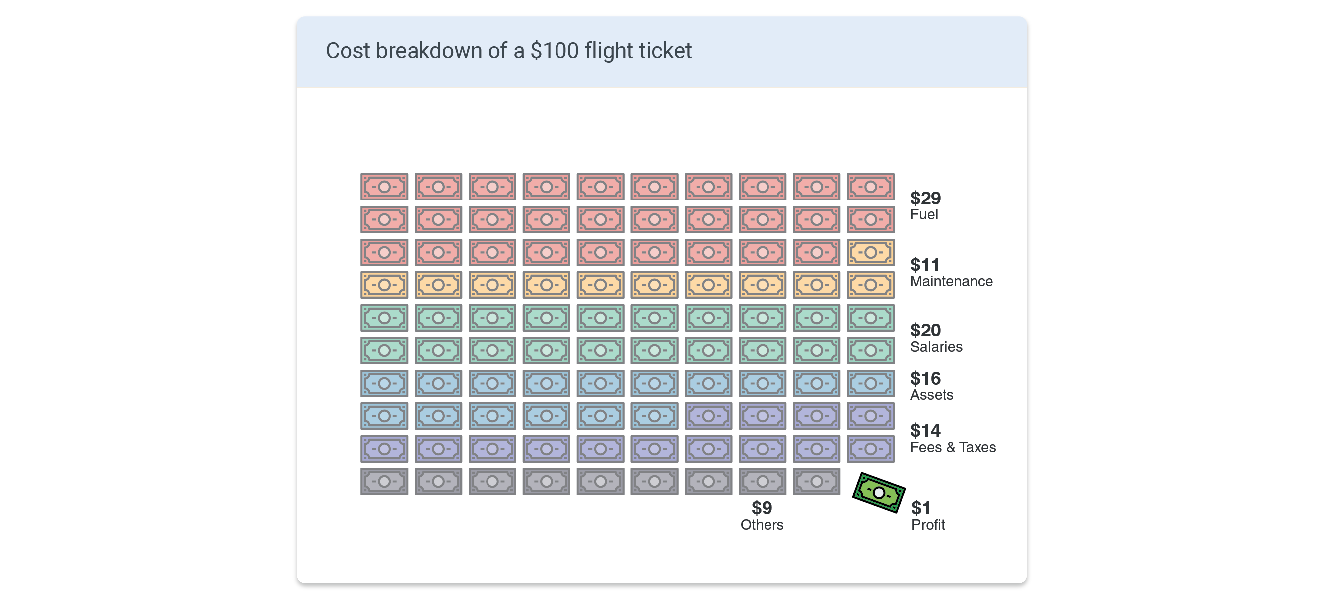
Before diving into competition effects, it helps to understand what a ticket actually pays for. On a $100 flight, the largest slice goes to fuel ($29) — the most volatile cost, tightly coupled to oil prices and the broader economy. Labor accounts for $20, aircraft and facilities for $16, maintenance for $11, fees and taxes for $14, and other costs for $9. Profit? Just $1.
The takeaway: a large portion of every ticket price is fixed overhead that has nothing to do with the specific route. We'll revisit this "base cost" when building the regression model.
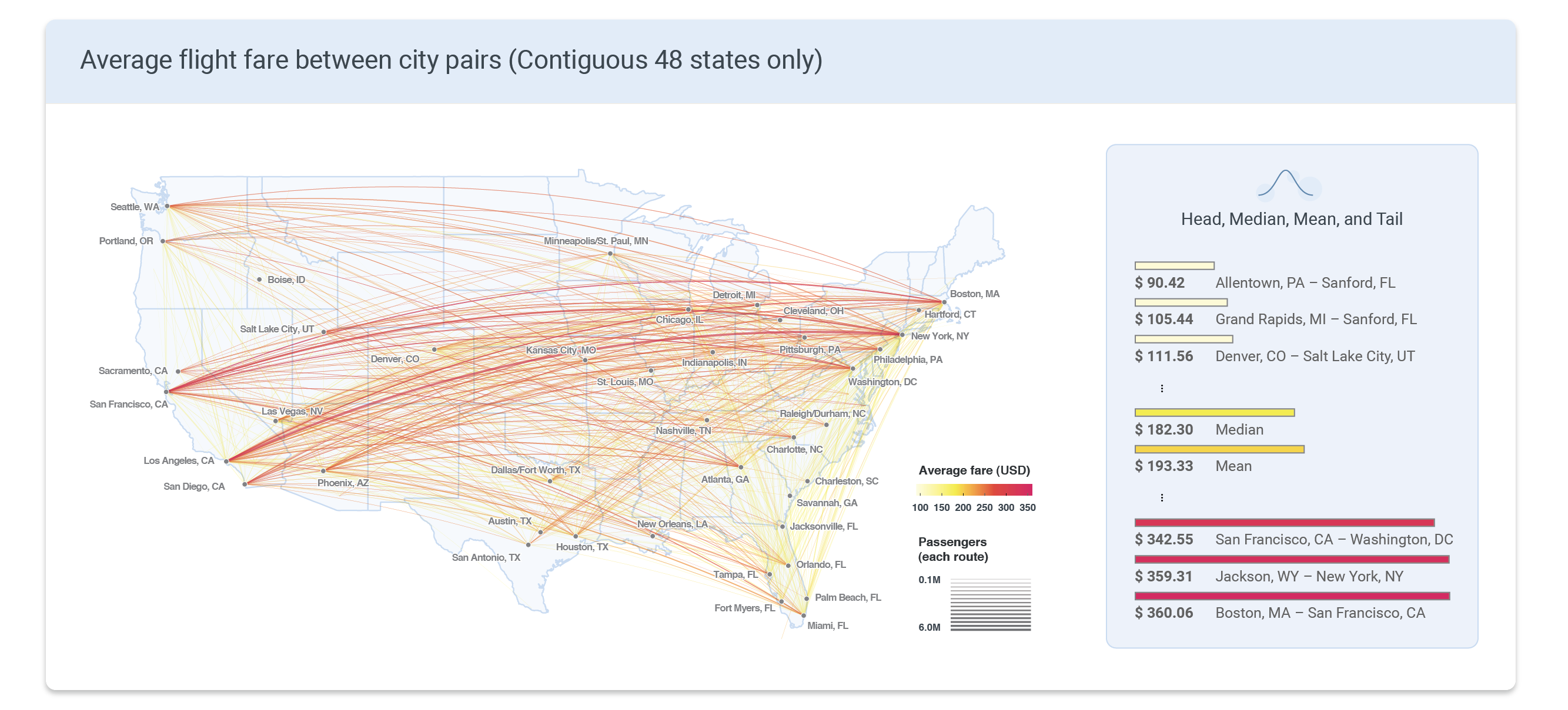
The portion of costs that do scale with distance — fuel and part of labor — suggest a linear relationship between fare and flight length. The map below shows average one-way fares between city pairs across the contiguous 48 states (Alaska and Hawaii are excluded due to data limitations). As expected, transcontinental routes dominate the top of the price range: Boston–San Francisco ($360), Jackson WY–New York ($359), and San Francisco–Washington DC ($343) were the priciest. Short-haul routes skew cheap. The median fare was $182; the mean, $193.
📏 Distance vs. Price
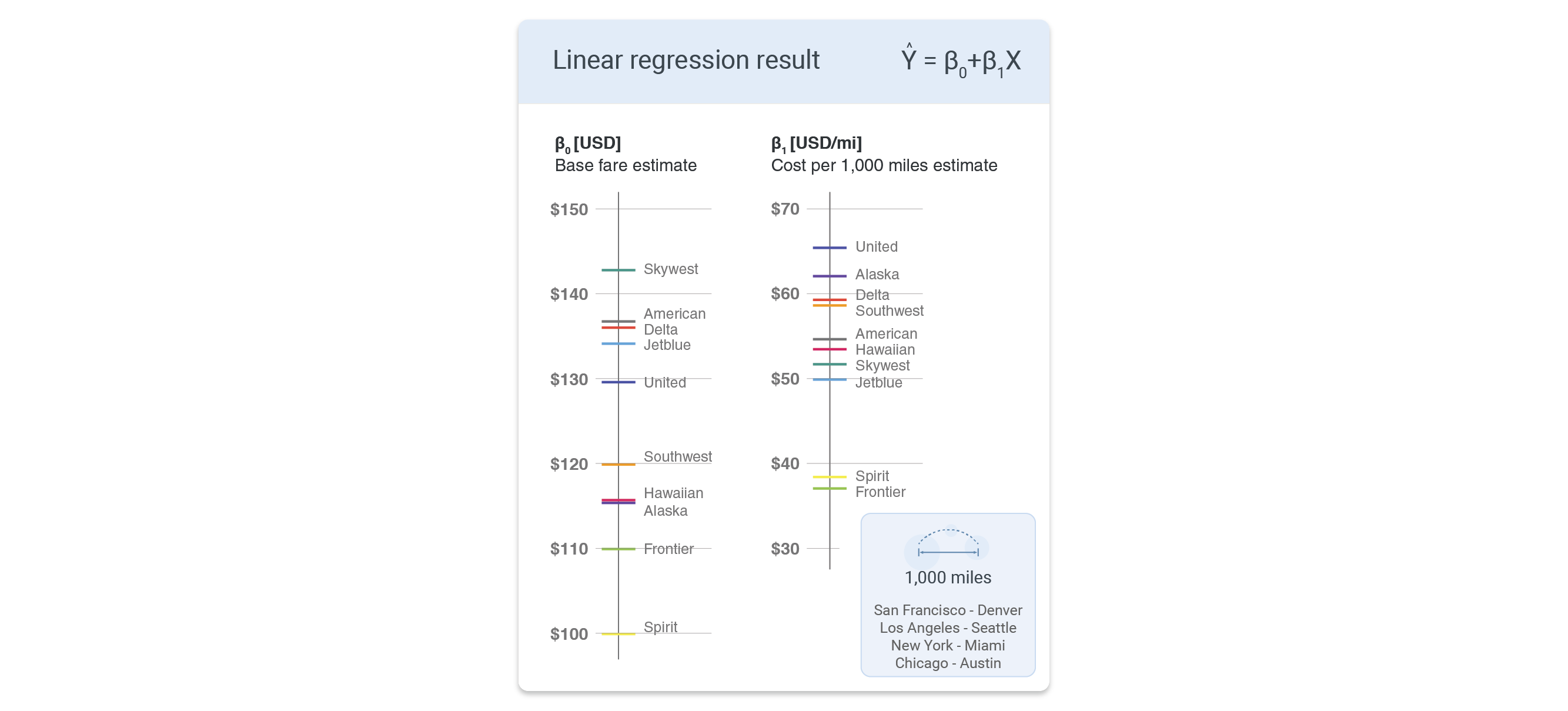
To quantify the base fare and cost per mile for each airline, a linear regression was run with fare as the outcome and distance as the predictor — grouped by carrier. In the scatter plot below, β0 is the y-intercept (the base fare a passenger pays regardless of distance) and β1 is the cost per mile. For American Airlines, for example, every additional 1,000 miles adds roughly $54.63 to the fare.
As expected, low-cost carriers Spirit and Frontier sit well below the pack. Full-service carriers — American, Delta, United — cluster toward the top.
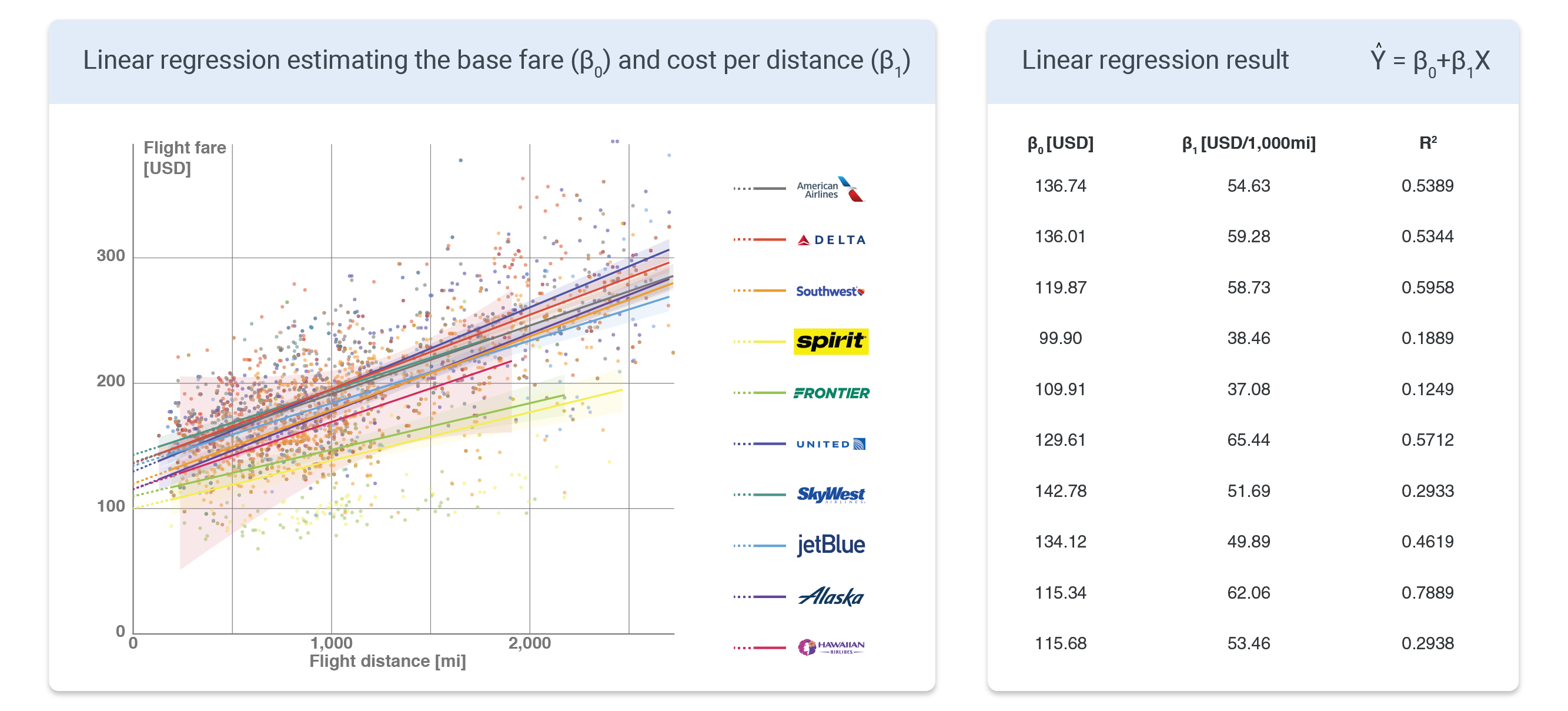
Looking at the regression coefficients in isolation: the highest base fares belong to SkyWest, American, Delta, JetBlue, and United. SkyWest and JetBlue's presence near the top is somewhat surprising given their positioning. For cost per mile, United, Alaska, Delta, Southwest, and American lead the list. Spirit and Frontier again anchor the cheap end on both metrics.
🥊 Competition
Distance alone doesn't explain enough of the variance in fares — R2 leaves room for improvement. A natural next variable is competition. Unlike fixed-price retail goods, flight tickets are dynamically priced based on supply and demand, so more competing airlines on a route should push prices down.
The scatter plot below confirms this. Each point is a city pair, colored by the number of airlines serving that route. Routes with more competition (blue) are systematically cheaper than monopolized routes (red), at every distance.
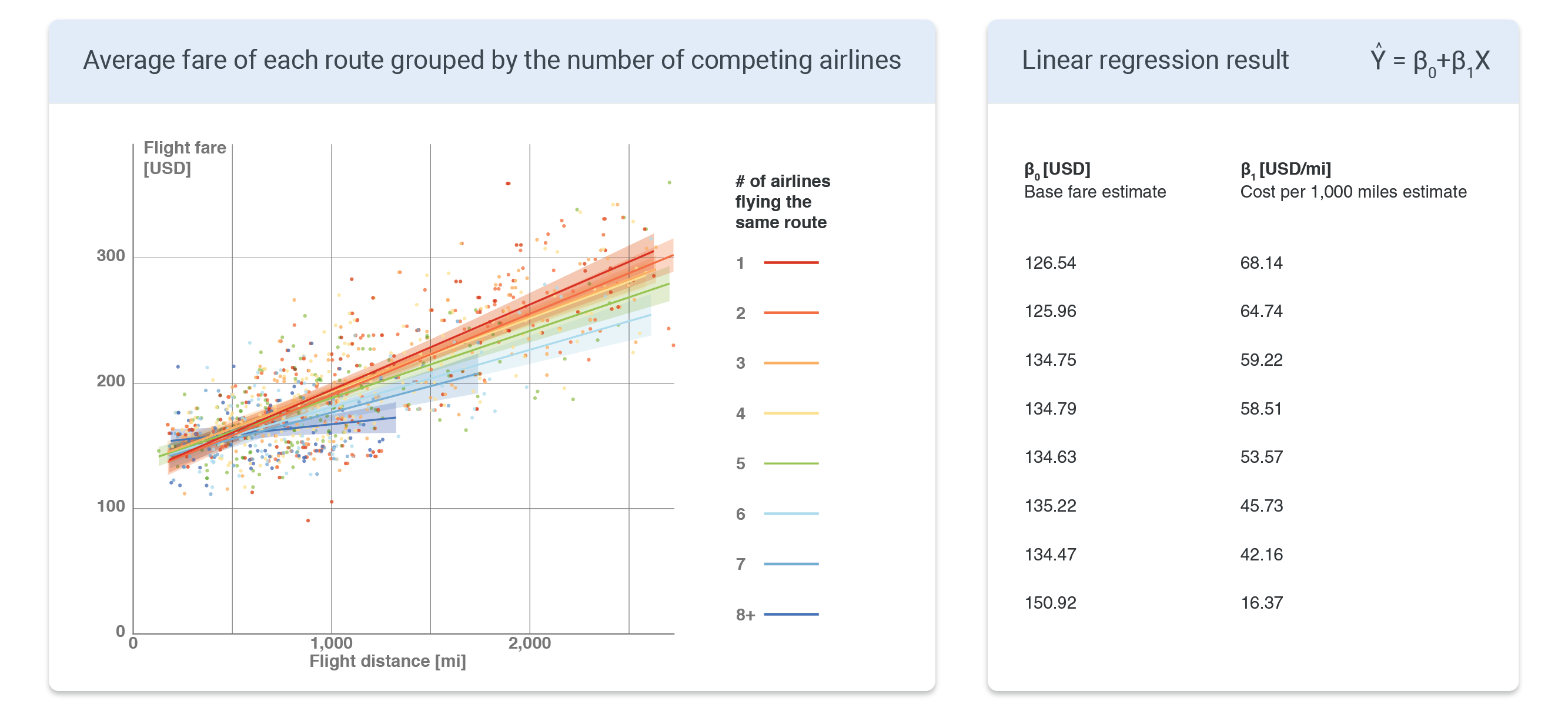
Plotting β0 and β1 against the number of competitors reveals an important asymmetry: the base fare β0 stays roughly constant regardless of competition — airlines still have to pay fixed costs like airport fees no matter who else is flying the route. But the cost per mile β1 falls steadily as competition increases. More airlines on a route means cheaper fares per mile, not cheaper fares overall.

🏕️ The Hub Effect
If monopoly on a route raises prices, does monopoly on a hub airport do the same?
For major carriers, the answer is yes — but modestly. Delta and United flights cost roughly $10 more when routing through a hub. American's coefficient points the same direction, though it falls short of statistical significance. This "hub premium" is consistent with the market dominance these airlines hold in key airports: American controls 91% of Charlotte, 85% of Dallas DFW, and 75% of Miami; Delta owns 79% of Atlanta; United runs 70% of Newark and 81% of Houston IAH.
Low-cost carriers tell a different story. For Spirit, routing through a hub actually reduces fares by nearly $20 for the same distance. The reason is operational efficiency: rather than flying point-to-point between every destination pair (which would require 45 flights to connect 10 cities), a hub-and-spoke model can serve the same network with just 9 flights. For a lean operation like Spirit, that savings gets passed to the customer.

🧮 Multiple Linear Regression
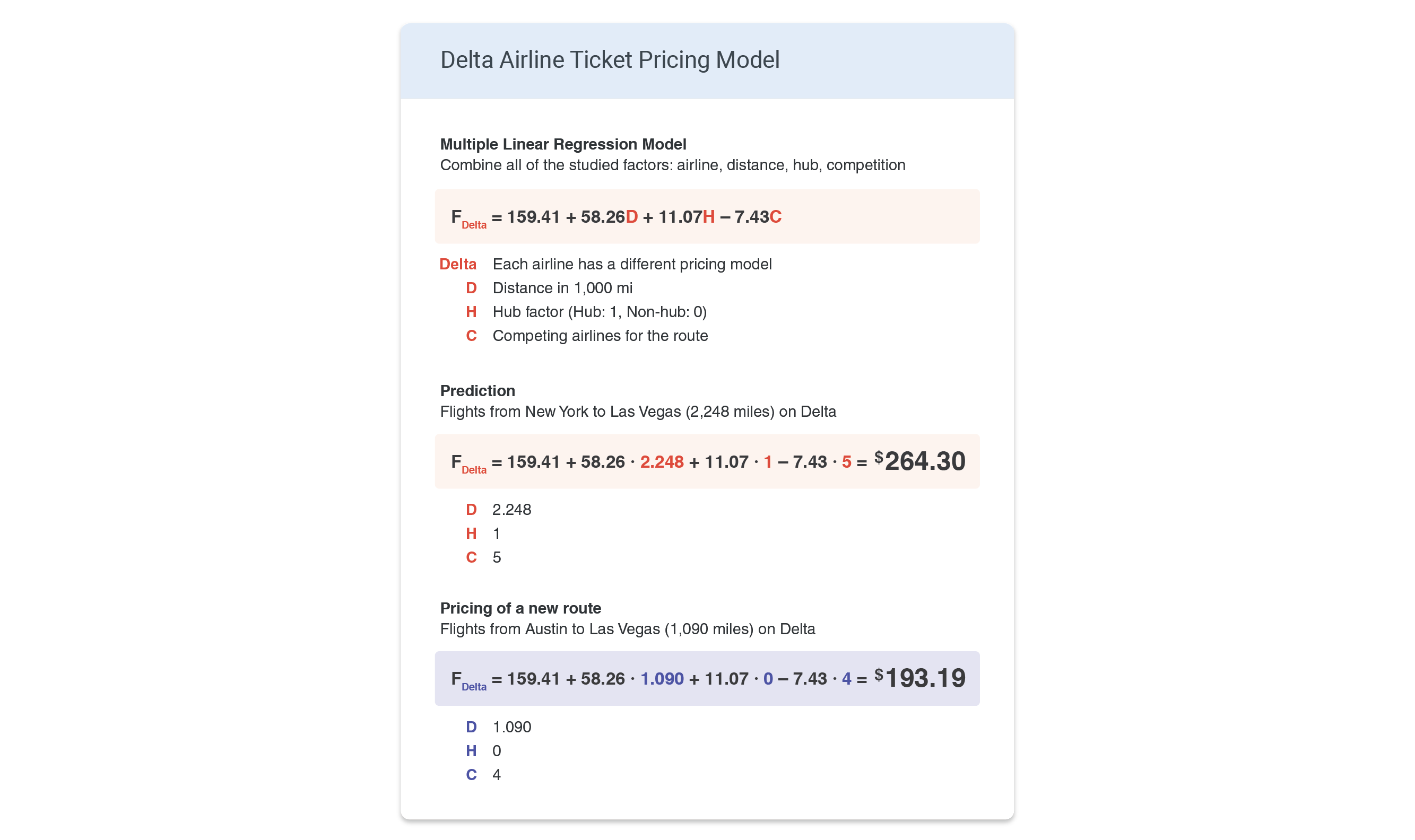
Bringing it all together: a multiple linear regression model was built for each airline using three predictors — distance (D, in thousands of miles), hub factor (H: 1 if the route passes through a hub, 0 otherwise), and competition (C: number of airlines on the route including the carrier itself). The model can predict the average fare for any route.
As a worked example: the predicted Delta fare between New York and Las Vegas comes out to $264.30. For a hypothetical new route — say, Delta launching Austin to Las Vegas (1,090 miles, no Delta hub at either end, 4 total competitors) — the model predicts an average fare of $193.19.
📝 Summary
- Airfare is driven by multiple factors: airline, distance, airport, and competitive landscape
- Base fare, cost per mile, hub premium/discount, and monopoly premium can each be estimated per airline and route
- A multiple linear regression model predicts average fares with three parameters: distance, hub factor, and competition
- Low-cost carriers use hub routing to cut costs → lower fares at hubs
- Full-service carriers (Delta, United, American) leverage hub dominance → higher fares at hubs
➡️ What's Next?
The model's biggest missing variable is time. Fares fluctuate significantly based on when you book and when you fly — demand spikes around holidays and vacation seasons, and different destinations have different seasonal peaks. Adding temporal features would meaningfully improve prediction accuracy.
Research on optimal booking windows suggests purchasing 1 to 4 months in advance for the best fares. The old myth that Tuesdays are the best day to book has largely been debunked — algorithms have gotten too smart for that kind of arbitrage to persist.
Another thread worth pulling: the continued rise of low-cost carriers. Southwest, now one of the largest US airlines by passenger volume, has proven that the low-cost model can compete directly with legacy carriers at scale. A deeper comparison of pricing strategies and demand elasticity between the two models could be genuinely useful for route planning decisions across the industry.
Data Sources
- U.S. Air Carriers Traffic and Capacity Data — Bureau of Transportation Statistics
- Domestic Airline Consumer Airfare Report — Bureau of Transportation Statistics
- World Airport Codes — Bureau of Transportation Statistics
- Airport longitude & latitude data — Ourairports.com
- How Airlines Spend Your Airfare — The Wall Street Journal
- Domestic market share of leading U.S. airlines — Statista
- Cover photo by Matthew Smith on Unsplash